Mega menus can be incredibly useful if designed and developed properly; however, they are one of the number one areas website user experience can suffer if improperly organized and implemented.
Does a mega menu make sense on my website?
Just because something is trendy and cool doesn’t mean its functional for your website. Mega menus can be very helpful for your users if designed and executed correctly and used in the appropriate instances.
Appropriate uses of a mega menu:
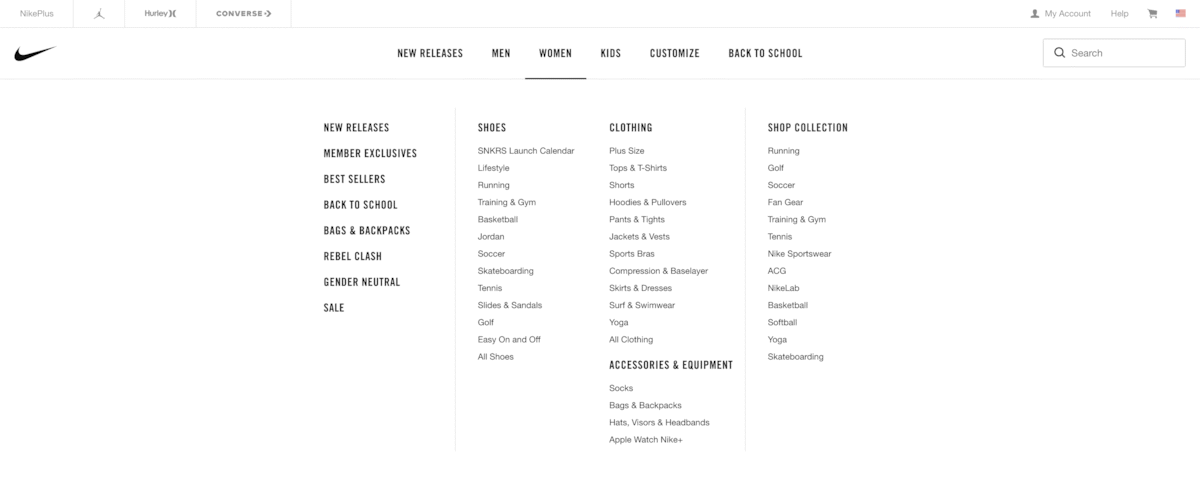
- Product directory: Use a mega menu when organizing a large number of products with multiple levels such as Women’s Clothing > Women’s Pants > Jeans.
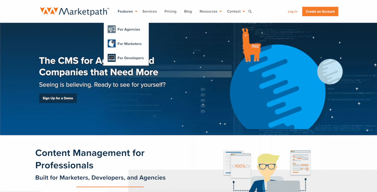
- More than 3 levels of drop-downs: If your drop-down menu ever reaches a third level, it’s time to consider a mega menu for better functionality or a reorganization of your sitemap. A third-level drop-down here and there isn’t the end of the world, but users can get lost in the overwhelming options of a large nested drop down menu.
- Promotions such as charities or sales: If you have a simple product that you want to highlight or an event for which you want to boost sales, a mega menu is appropriate. These types of mega menus are typically just a wider drop down with adjacent imagery.


When not to use a mega menu:
- Small sitemap: If your sitemap is a single layer deep or only has a few second levels, there is no need to consider a mega menu. A drop-down menu will be much simpler for your users.
- When your site is nothing but links (e.g. blog): Long titles and links within a mega menu are difficult to read. Mega menus are great for creating order, but titles must remain concise (~30 characters or less) for optimum legibility.
- On mobile: If you use a mega menu, it needs to have the functionality in place to load as a mobile menu at a certain breakpoint (tablet or mobile). A mega menu is too large, it will become illegible at smaller screen points.

Don’t Forget!
A few more important factors when building a mega menu:
- Consider ADA Compliance: A mega menu that relies on hover functionality can be unusable for someone who can’t use a mouse. Consider Americans with Disabilities Act (ADA) Compliance when programming a mega menu and add additional functionality for tabbing.
- Thoroughly test functionality and responsiveness: Ensure your mega menu functions correctly on all different screen sizes and breaks to a mobile menu when appropriate. Test how it hovers, if your ADA programming works, and if it breaks in any odd ways as screen size changes.

