You’ve been here before. You build an amazing, beautiful website that matches the designer’s specs perfectly. And you even had time to build in some new innovations that will save you time and effort on future projects.
Everybody is happy and corks pop out of champagne bottles with fanfare and gusto. It all goes on until you have to train those pesky content editors whose demands don’t mesh well with the efficient and intelligent ways you built the site.
They just don’t get it. No matter how many times you show them.
It’s one thing if those content editors are internal staff within your agency. You have a little more flexibility to tick them off because they are immersed in the same outcome you desire - an effective, speedy website.
But co-workers will harbor resentment which can inevitably strain your working relationship with them. Nobody wants to deal with toxic feelings from co-workers.
On the other side, external editors (i.e. clients) will not only harbor resentment but have direct lines of communication with whomever is writing the checks. If they get mad enough, they might just recommend finding a new agency partner.
What we need to do is establish a two dimensional UX plan. One dimension is for the website visitors we hope give us all their money. The other is the for content editors who put out the amazing content that makes those visitors give us all their money.
It is no surprise that the first dimension, the one for public website visitors, should come first. After all, this is the primary mechanism for capturing and growing business. Strategy, design, and messaging for this should be at the forefront of any design plan. I’m pretty sure nobody will argue this point.
The UX plan for content editors typically takes a back seat, but as we’ve all seen, back seat riders can yell and scream and drive us completely bonkers. We have to look at the front-end requirements and develop a data plan that fits the design. From this, we develop a strategy around how editors will create and update that data.
Let’s discuss some key considerations to keep in mind when building a site for editors.
With our data plan, we need to minimize the number of steps an editor must take to make changes. This can be a difficult balance, especially if you have a lot of relational data that can create many different locations where data is edited.
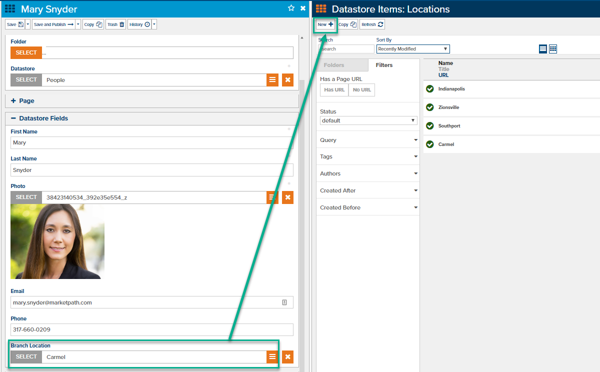
Some professional content management systems allow editors to create new related data without navigating away from the data they’re currently editing (fig. 1). This is quite helpful in keeping the editor focused and not lost in the weeds.

Figure 1 - Ability to create new content without leaving your current editing view
If you’re able, keep as much content in one view as possible. Content editors mostly associate the content on pages with a single item, even though that may not be the case. If you can keep most of the content in one spot you’ll make it easier on them.
As developers, we love to make code and content reusable. Anything else goes against what we stand for. However, that kind of thinking can get us into trouble because we want to iterate again and again until things are just perfect. And they may be perfect from a structural standpoint but they can easily end up a convoluted mess for the editor.
Making some sacrifices in structure and even speed enhancements (if minimal) are okay if they improve a content editors’ ability to get in and get work done without your help.
So many websites are built without a real plan that it becomes a guessing game for all parties involved. You don’t build a house, even a modular home, without some sort of blueprint. So why would you build a website and its many interconnected parts without one?
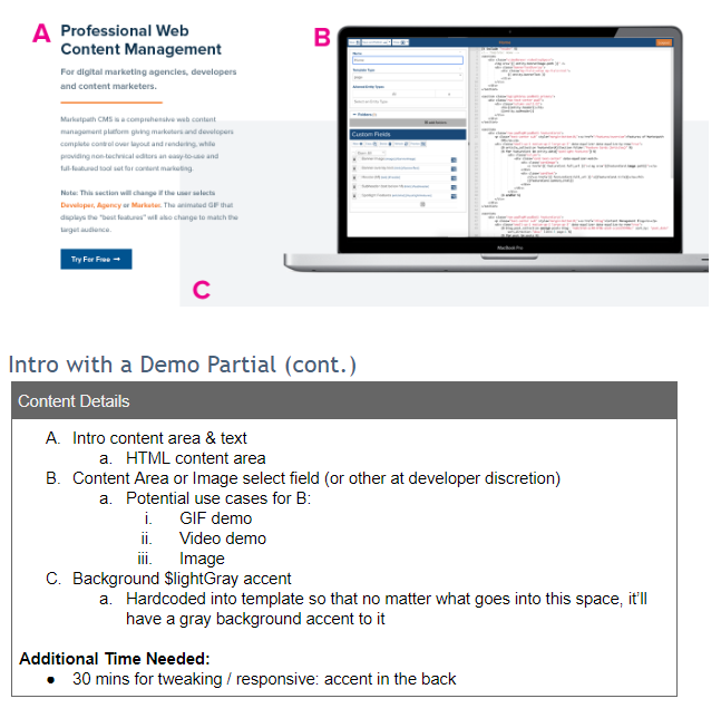
When we build internal sites or new Marketpath CMS templates, we assemble what we call a detailed design document. This has all sorts of information about the site, like personas, branding, calls-to-action, sitemap, page templates, and page and section details. What’s most important for this post is the page and section details. This looks like figure 2 below.

Figure 2 - Website detailed design document, section details
Your client has to receive and sign off on this document before any development begins. This avoids unnecessary development delays and scope creep.
The best part about this document is that it can be handed to you and you can hit the ground running. If the planning was done right there will be very few questions and few needs for revision.
Plugins can be wonderful tools that add much needed capabilities to your site. Some plugins, however, have an entirely different user experience. Your best bet is to find plugins that accomplish your goals but don’t deviate much from your CMS platform’s user experience.
Whether the editors for the site you’re building are pros or novices, you should chat with them and ask them about pain points they’ve had with other sites they work in. Their pain points will help guide you into making different decisions that help them be better, more efficient editors.
And ultimately, when you can appease your content editors, you’ll keep them off your back so you can do what you do best.
Marketpath CMS has a consistent user experience for content editors - finding content, creating new content, and making updates are a breeze.