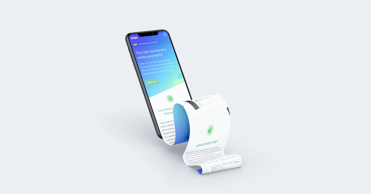
Web designers are embracing the long scrolling website design trend for their various benefits. But a single page website may not be the right style for your target audience.
There's a wealth of considerations that go into a website's design. A format like a long scrolling site is going to substantially impact the way users engage with your site and view information but it will also affect your search engine optimization. As the page fills in with content as users scroll, it provides a wealth of information for your audience from page one. This has its benefits, but there are some drawbacks that you might not want to overlook as you consider your audience and the nature of the shared information.
There are some seriously strong pros that favor the long scrolling website, particularly if you're concerned about your mobile audience. Consider:
Since the relevant information is contained on one really long webpage, visitors to your website can typically access what they need without multiple clicks. These sites often experience reduced 'bounce' because visitors don't have to figure out how or where to navigate from the home page. For instance, Time.com reported reduced bounce rates when it adopted its long scroll / infinite scroll site. When it's all there, users simply scroll down without the need to click off the page or, worse, off the website.
A long scrolling website is, in many ways, the ideal format for storytelling. You can immerse users in your brand's story with a creative, seamless design with a clear beginning, middle, and end. By employing dynamic content like imagery, you foster a level of engagement that traditional websites typically don't enjoy when it comes to storytelling because the customer is forced to click here and there without ever getting a complete picture all at once.
The long scroll format translates well to the mobile screen. With 72% of users searching via a mobile device, it makes sense to use a format that is conducive to your mobile audience. Check the site's web analytics tools and try to determine what percentage of your own target audience is relying on mobile devices to access the internet. The research will help you make these essential design decisions.
Before you call your designer and tell them to go with a long scroll website, wait and reflect on the downside of one page websites. Some scrolling design drawbacks could be deal breakers for your particular business.
A great scrolling website should present all relevant information to users, making the site easy for them to navigate. However, an abundance of content presented on the long page can also be confusing. Important items can get lost as users scroll up and down to find the information they need.
UX Designers are keenly aware that white space creates balance and allows for important things to stand out on a web page. With a scrolling webpage, images help to create white space. However, too many images and animations can reduce your loading time. If you intend to enliven your home page with rich, dynamic content like images and videos, your site could suffer slow loading times--which is the kiss of death--especially if you're trying to market to that mobile audience that this format is supposed to capture.
Multiple animations require fast internet speed. Users are inclined to bounce if loading takes too long. Filling in and using more than the usual amount of images to make your long page look attractive and balanced could lead to inflated largest contentful paint (LCP). Plus, if you're using videos and animations, the page speed could be further impacted. Your developer will be able to implement code to help offset the slowness, but to what extent do you want to add more labor hours when you could just do a different page?
Each website page gives a business the opportunity to alert search engines that it has relevant, authoritative content to share. Every page is another chance to entice these search engines to send traffic your way. With one page website, your opportunities become more limited. When you combine multiple pages you combine multiple terms and you then make it harder for your site to rank for multiple terms.
Now, you've seen some of the benefits and drawbacks of long scrolling sites. Keep these considerations in mind so you can make an ideal decision for your clients.
A long scrolling website is mobile friendly and provide fast access to information for your target audience. But they can also suffer from slow loading times and detract from your SEO. Marketpath CMS is versatile enough that marketers and designers can create and tweak developed sites. If you build a long scroll site, and want to revert to single pages or vice versa, you have the ability to. Plus, you get the added benefit of reusable content, automation, and are able to personalize pages to personas.