When a website has a lot of content, search can be an invaluable tool to a website visitor. This is especially true if you cannot readily provide what the visitor is looking for on the front page or top level pages of your website.
Your search button is your greatest assistant to quickly get your users the answers they are looking for. It does, however, need to be well designed. This is because your search box will keep your users on your site. Instead of leaving your website in frustration when they cannot find the information they are seeking, your viewers will simply submit a query.
I would argue you almost always need a search button unless you have a very small website. However, even if your website begins small and you plan on growing, you'll need a site search to keep up with your content long term. You will want a well-functioning search if you feel that your website's content is growing beyond the navigation you have set up.
If you are designing a large site, such as an e-commerce website, a help website, or you intend to share a great deal of content, you might benefit from designing your site with a search box as a focal point from the very beginning. Making the search a priority in the design of large product or topic-driven websites will encourage your users to seek what they are looking for on their own, and quickly.

People are accustomed to certain symbols meaning certain things, and the familiar magnifying glass icon representing search is no different. Do not try and reinvent the wheel when it comes to common actions (saving, searching, downloading, etc.) on your website.
Similarly, if search needs to be a priority in your website (i.e. a large site or a e-commerce website), make it prominent on the home page or in your header navigation. Regardless of priority, make search accessible on every page in your primary navigation in some way, shape, or form.

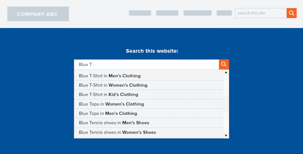
Auto-suggestions help users find what they are looking for more quickly, and it helps to guide their search queries to targeted keywords. Sometimes users don't know how to properly frame their questions and giving auto-suggestions will aid them in effectively searching your website for their answers.
When you are creating your auto-suggestions, use keywords in a way which will be helpful for your users. Use keywords, predictive text, and commonly asked questions. Present a range of options in the search results box so that your users are able to select a closer match to what they are looking for.

Without a well designed and well executed search bar or button, your users will leave your website within a matter of minutes or less to find information elsewhere. You've then lost a potential client or customer to, possibly, your competitors.