
Styling forms is incredibly important for collecting data from your users. Whether its a sign-up wizard, a checkout process, or monotonous tax information, here are the Do’s and Don’ts for designing more user-friendly forms.
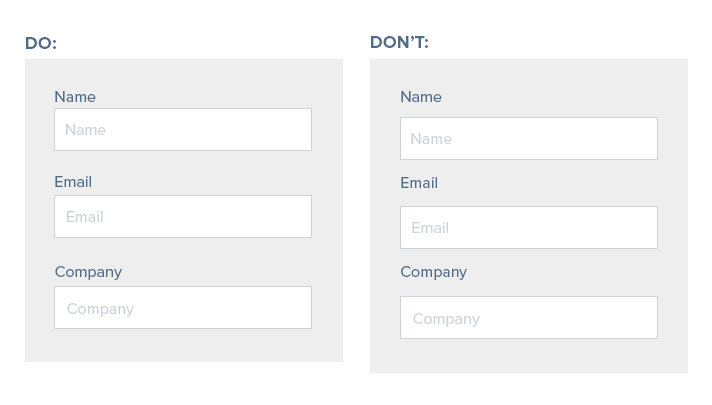
Something as simple as making sure input labels are closer to their input box with a larger margin in between input groups will increase legibility.
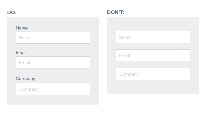
As much as we want to simplify and reduce form length, we must resist the temptation to use the input label within the fieldset as the field label. Once a user clicks into the input text, they’ll immediately lose the label and this can lead to confusion for users, especially on longer forms.
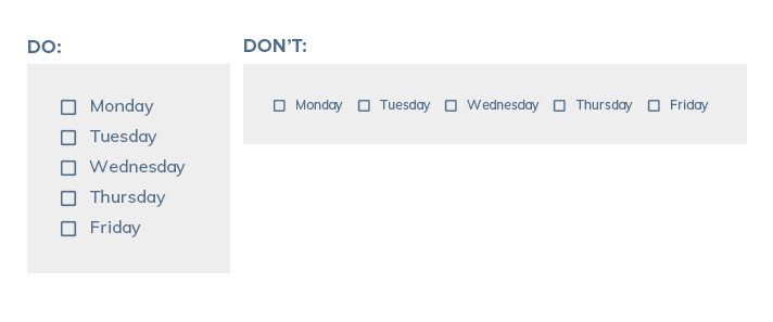
Ever notice that it’s easier for you to read a bulleted list than a paragraph of information? That’s because users consume information more quickly top to bottom than left to right. Stack checkboxes and radio buttons top to bottom rather than left to right for ease of consumption to your users.
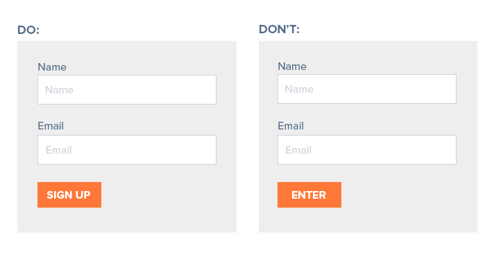
Button UX/UI and input text is just as important as how the form looks. Be clear in your word choice so that a user is clear what action will occur when clicking your button.
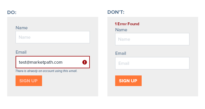
There is nothing more confusing than an unclear error. Generic errors put all of the work on the end users, which will more than likely result in either a frustrating user experience or an abandonment of the form altogether. Giving a user inline error codes give explicit instruction to the user where they need to fix their data.
Field length gives the user unwritten instruction as to what their input should be. For complete clarity, as well the ability to mitigate bad data, consider shortening field lengths to the appropriate width for fieldsets that always contain a specific number of characters such as postal codes and phone numbers.

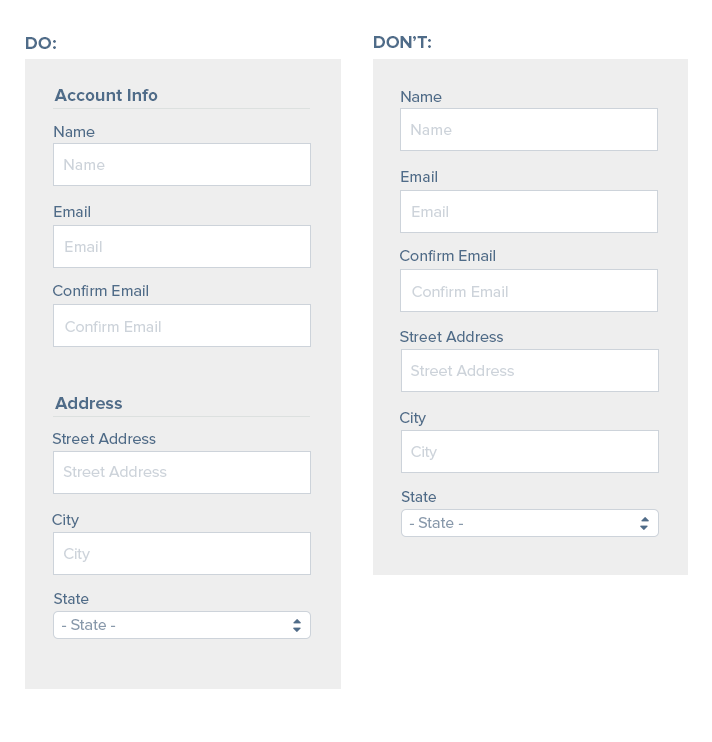
Lastly, group related information on longer forms into consumable sections of data. It makes users feel less overwhelmed by long forms and is easier for users to consume in chunks.
At the end of the day, no one really wants to fill out a form, but there are a lot of ways that you can make your forms easier to use and clear to your users. An easy-to-use form is a surefire way to an increase in conversions, sales, and engagement!